A financial company looking to evolve its legacy brand to meet a new generation of investors.
Client
Finanical Service Company
Contribution
Website design, Strategy
Timeline
Oct 2024 - Feb 2025
When the company was expanding its business to offer new annuity projects, it knew it was time for a brand and website refresh.
But even though the company had a century of industry experience, its identity and web presence were splintered across three sites, each representing a distinct aspect of the business. They needed a consumer-grade web experience that catered to all their audiences, new and old.
The challenge:
Evolve the brand while respecting a deeply rooted legacy
The company’s logo, color palette, and font choice were off-limits, we had to modernize without replacing. And the business itself was still aligning internally on how the new retail offering would coexist with its institutional identity. We weren’t just designing a site, we were helping facilitate brand clarity.
The process
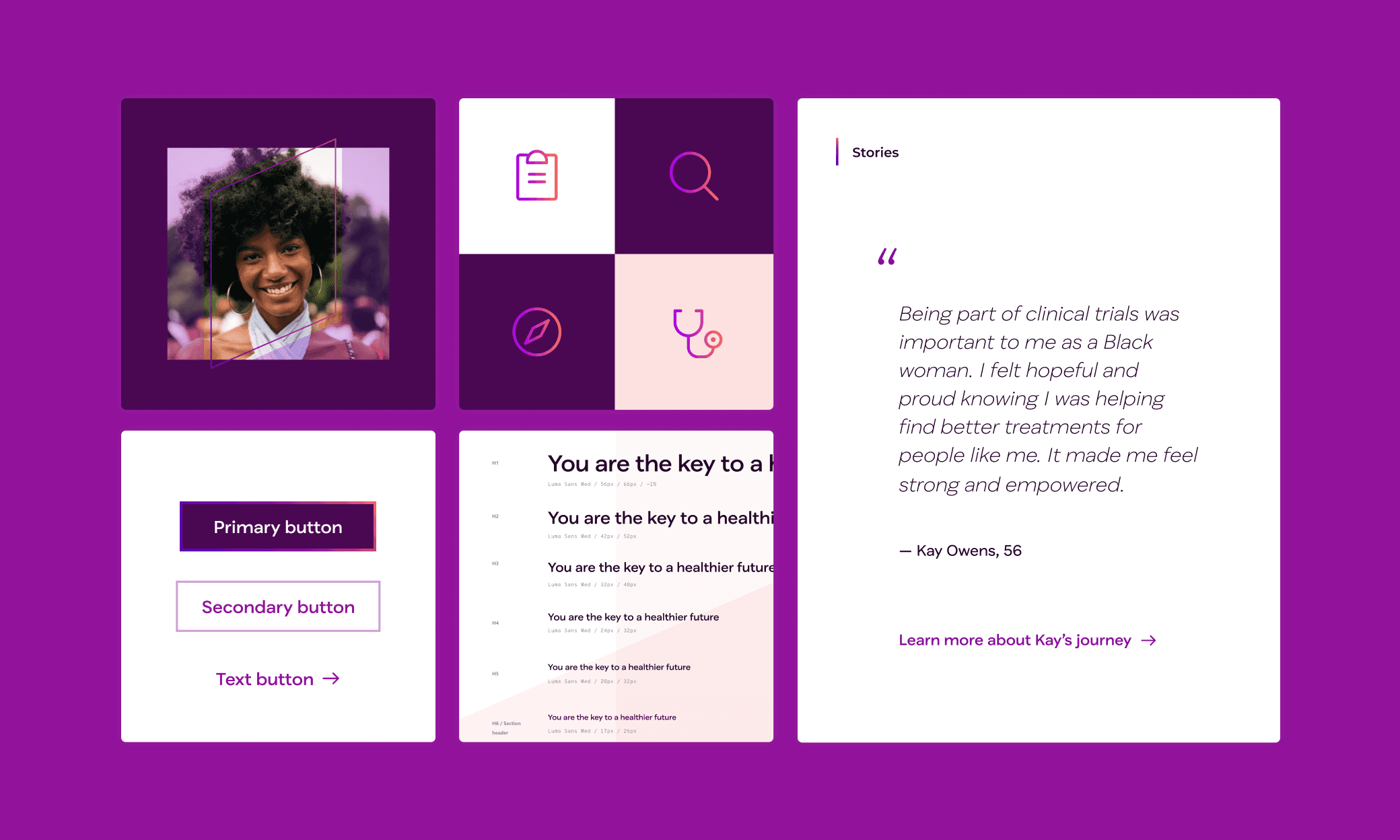
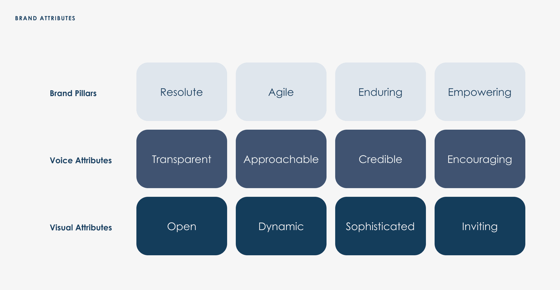
Through competitive analysis, site audits, interviews, questionnaires, and a hands-on workshop, we uncovered important insights about the company’s aspirations and audiences. Working with a brand strategist, I helped translated those findings into a set of brand pillars that would guide not only the website but other parallel work streams across the organization.
We used style tiles to explore how each brand attribute—Open, Dynamic, Sophisticated, Inviting—could be dialed up or down visually. The client gravitated toward Inviting, with touches of Sophistication, leading to a visual system that was:
Inviting and calm
Grounded in captivating photography
Built on curved motifs drawn from the brand’s logo
Visually distinct from competitors’ brash or edgy aesthetics
The homepage became an opportunity to discuss a deeper business decision: how much focus should the new retail arm receive? We presented two versions, one retail-forward, the other more balanced.
Ultimately, the client chose the balanced direction, a move that subtly reinforced the company’s unified identity.

the outcome
The project delivered:
A unified web experience that serves legacy, institutional, and retail users
A refreshed visual identity grounded in strategy and research
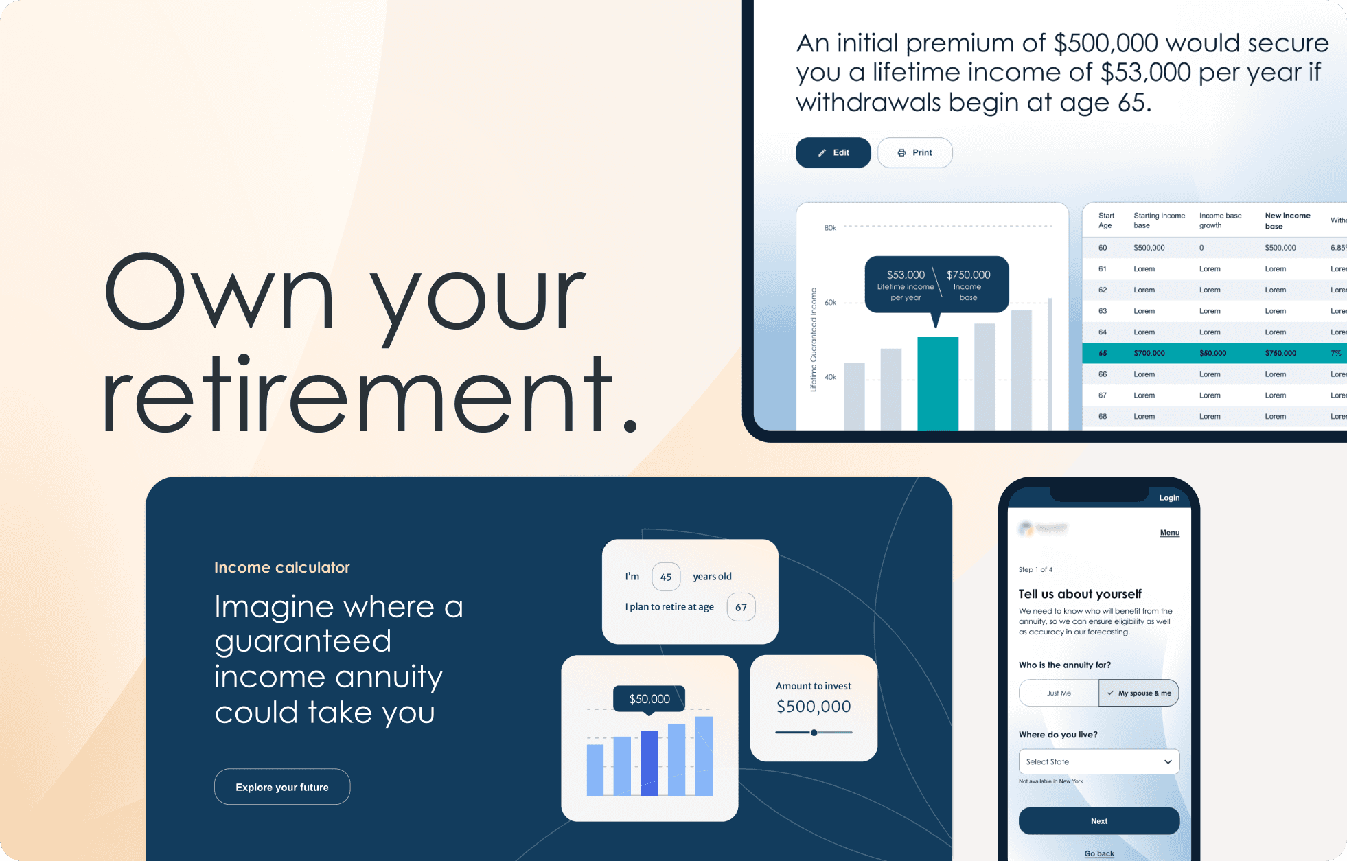
A consumer-grade digital experience with tools like the annuity calculator
Intuitive authoring capabilities, so the client’s team could manage updates without relying on IT
A flexible, future-proof foundation to support growth
Want to hear more and learn about some of the challenges and solutions, reach out!