
Domain
Healthcare & Nonprofit
My Role
Visual design
Timeline
April 2024 - June 2024

Context
Challenge
Create a cohesive, approachable experience while building a system that developers could implement and the client could maintain after launch.
Design direction
Research led by the UX team highlighted four principles that guided my visual decisions: consistency builds trust, approachable layouts reduce cognitive barriers, authentic representation matters, and clear calls to action make taking the next step easier.
I explored two visual directions:

✔️ Pops of vibrant color with liberal white space
✔️ Extends the PAN brand naturally
✔️ Scales into a reusable design system
Tradeoff
Depends on sourcing authentic photography

✔️ Bright, optimistic tone
✔️ Keeps focus on education content
✔️ Reinforces accessibility
Tradeoff
Felt more metaphorical than mission-driven

Building the system
With the visual direction established, I translated it into a reusable design system that could support the custom Salesforce experience.
I established Figma variables for color, typography, and spacing so multiple designers could work consistently within a shared file. I also developed component variations and documented their intended use, behavior, and relationship to the broader interface.
This work helped turn the visual direction into a repeatable system rather than a collection of individually designed pages.

Connecting design to the CMS
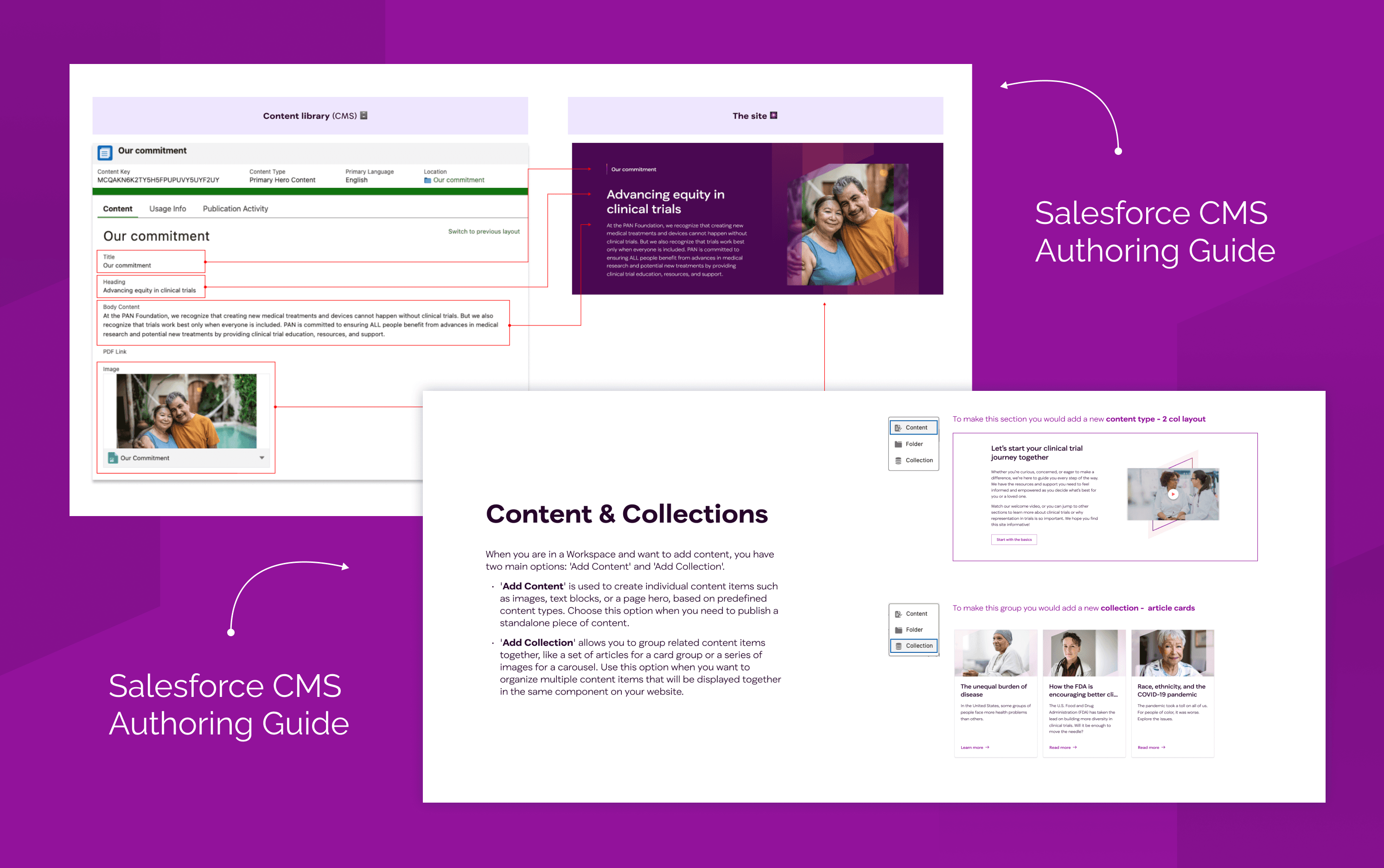
The custom components introduced a challenge beyond visual consistency: developers needed clear implementation guidance, and the client needed to understand how to use the resulting components after launch.
I created a component authoring catalog documenting each component's purpose, variations, page usage, CMS fields, and authoring rules. Where components depended on other content being created first, I documented those relationships as well.
I mapped the Figma documentation and component catalog to the Salesforce build, worked with developers through QA, and trained the client's team to manage content independently.
The goal was to make the system useful beyond the design file: a shared reference for implementation and a practical guide for the people maintaining the site.
Impact
Created a reusable visual foundation: Established patterns that extended beyond the initial microsite.
Influenced future work: The design system was later adopted during the PAN Foundation's broader website redesign.
Learnings
A design system's value extends beyond consistency in the interface. It also depends on how clearly the system communicates its intent to the people building, using, and maintaining it.
This project reinforced the importance of designing for the full product lifecycle. Under tight constraints, component reuse, clear documentation, and shared guidance helped connect visual craft to implementation and long-term ownership.
