A soon to launch non-profit needed to position themselves as leaders in employee ownership advocacy.
Client
Ownership Works
Contribution
Brand Identity / Website Design
Timeline
Sep 2022 - Feb 2023
Before
A powerful idea, but no presence
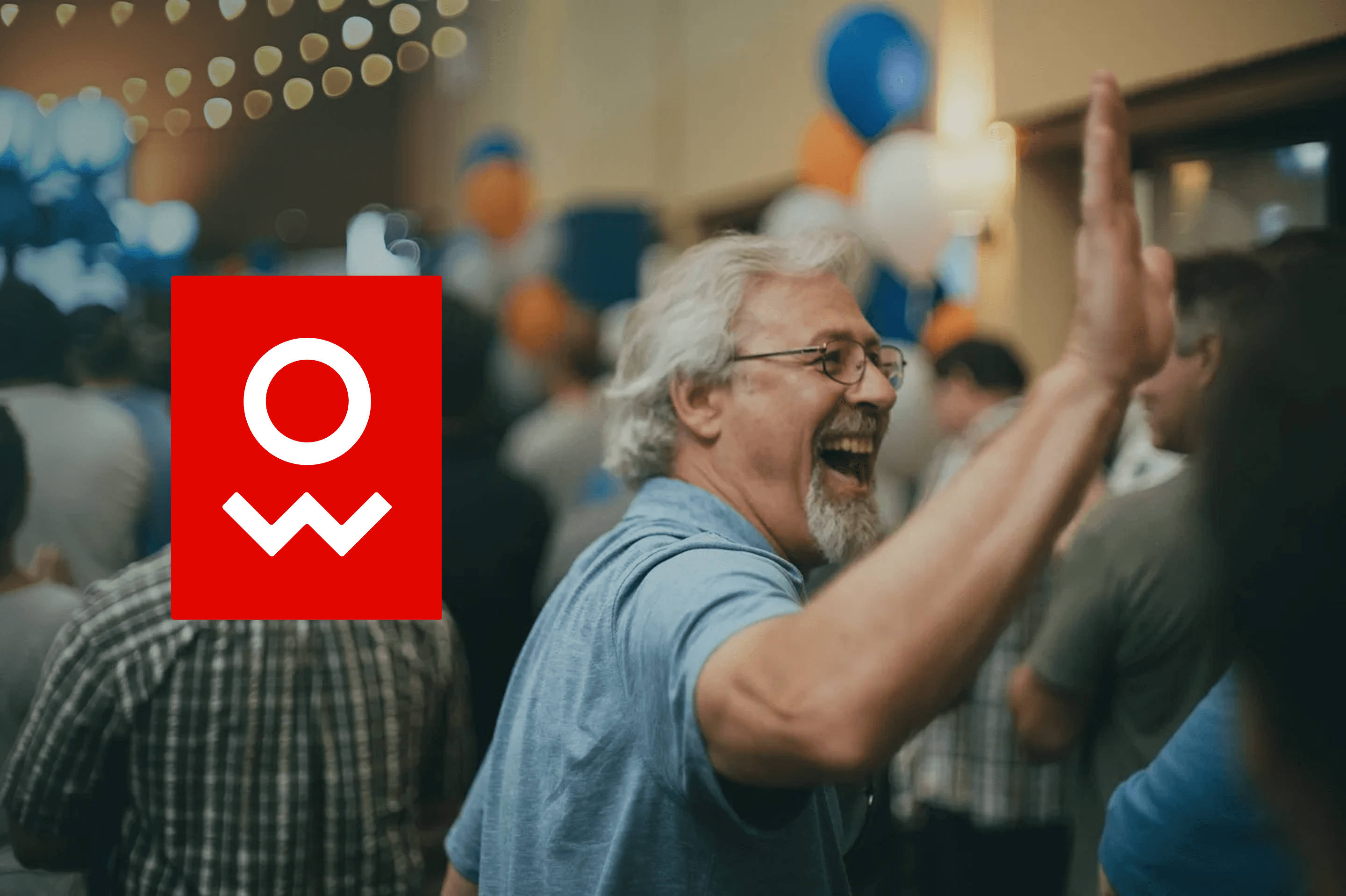
In 2022, Pete Stavros of KKR founded a nonprofit with an ambitious mission: to reshape capitalism by expanding shared ownership models to workers across the country. The organization was backed by data, influence, and vision but it had no name, brand, or digital presence. This project needed to:
Introduce a new nonprofit to the world
Build credibility with financial, labor, and policy sectors
Inspire trust across diverse stakeholders from private equity firms to frontline workers
Create a flexible brand system and website that could scale as the organization grew
After
A scalable brand and digital home for a national movement
We delivered:
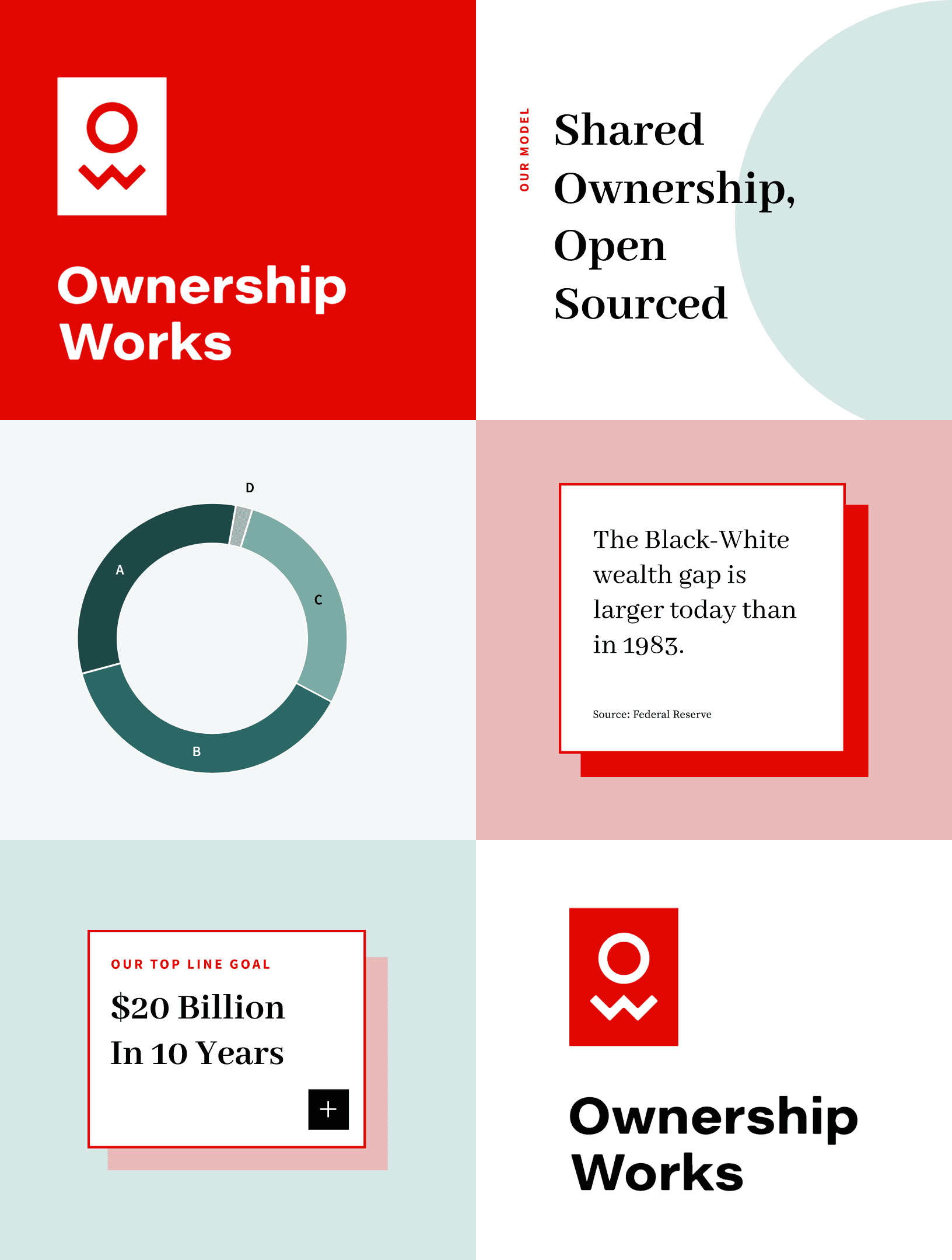
A bold brand identity rooted in accessibility and credibility, centered around the idea that Ownership Works
A confident logo blending a worker-forward monogram with corporate energy and editorial polish
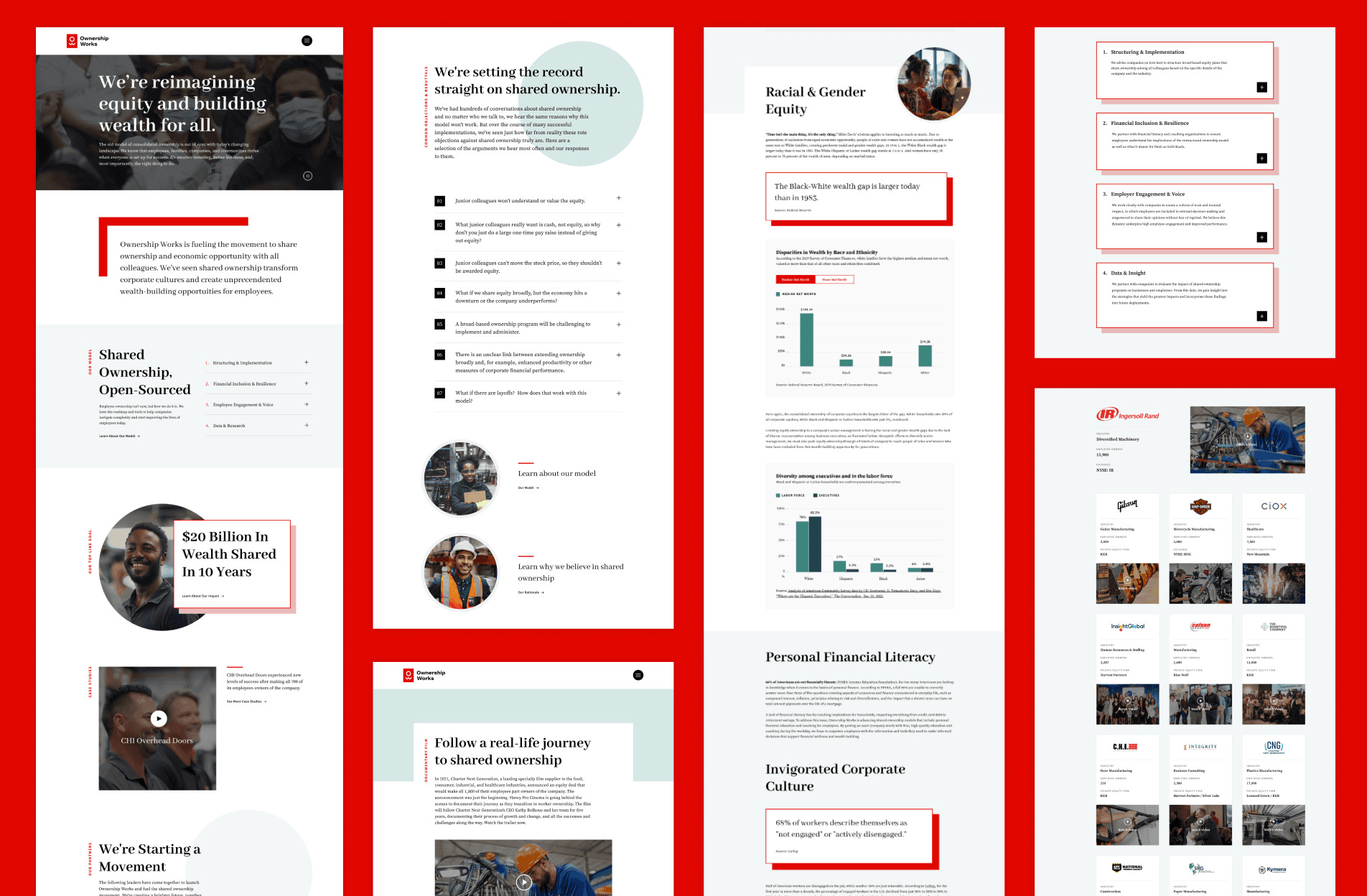
A website that clearly communicated the movement’s mission and impact while appealing to press, funders, investors, and advocates
Brand and component guidelines in Figma, enabling future team members and collaborators to onboard and grow consistency
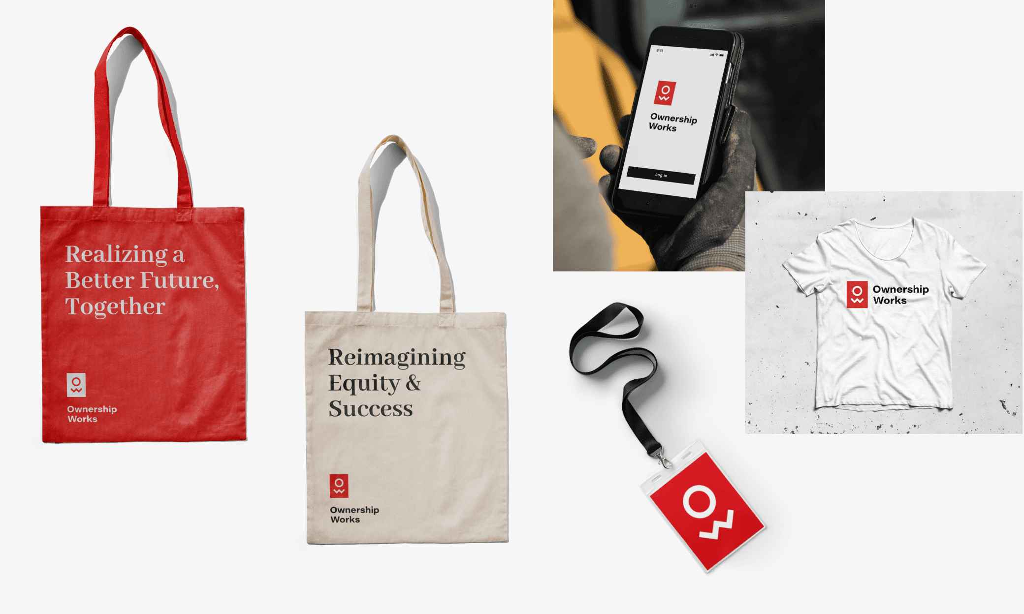
Custom collateral, including a full-page launch ad in The New York Times and a thank-you page for early partners
Since launch:
95,000 employees across 66 companies have joined shared ownership programs
Over $350 million has been paid out to workers—half of it going to people of color
76 institutional partners have committed to the model
How we brought the vision to life
Grounded in a name that says it all
The project began with the name Ownership Works, developed by Tanj naming studio. It was a perfect mix of pragmatic and rallying, and it became our creative north star as we translated it into visual identity.
Designing with purpose and range
Through client workshops and brand questionnaires, we developed a set of brand pillars that expressed the organization’s values: Bold, Open, Humanistic, and Dynamic. I translated those into visual attributes that guided our logo, type, and palette explorations.
Logo: A geometric monogram ("O" and "W") forming a human figure, like a badge photo, framed in a red square to create a sense of urgency and confidence.
Typography: Editorial serif and sans-serif pairings (Abhaya Libre, Source Serif Pro, and Source Sans Pro) positioned the brand credibly in financial and policy conversations.
Color Palette: Balanced the bold red of the logo and added calming neutrals and greens to balance energy with trust and approachability.
From brand to web
The website translated the identity into a professional, editorial digital experience:
Clear content pathways for new visitors, policy advocates, and financial institutions
Brand motifs (logo shapes) used to frame photography and content
Intuitive navigation and opportunities for users to dig deeper into the ideas behind the movement
We designed tools for longevity, including Figma documentation, voice and visual attribute, and a component library, these would be vital resources as the organization quickly scaled its team.
Want to learn more about this project? Lets chat!