Domain
Financial Services
My Role
Design Lead
Timeline
2024 - 2025
Context
Talcott Financial, spun off from The Hartford in 2018, is a life insurance and annuity company preparing to launch its first retail offering. I led the design of its unified web presence from strategy through to website QA, consolidating three fragmented sites into one experience.
Challenge
One company. Three websites. Multiple audiences.
Talcott's digital presence reflected its organizational history rather than the experience customers expected. The redesign needed to unify the brand without disrupting the people who already depended on it.
Three sites. Each business line operated its own website, creating inconsistent branding, navigation, and information architecture.
A brand in transition. The upcoming retail launch required introducing a more approachable consumer experience while preserving credibility with institutional audiences.
Legacy customers couldn't be left behind. Thousands of existing policyholders still relied on a separate portal, making continuity just as important as modernization.
research and strategy
Finding Talcott's new space
I started with an audit of Talcott's existing digital experiences and a review of the competitive landscape. I worked with stakeholders to understand where the brand was currently and where leadership wanted it to go.

Exploration
I explored four visual directions, each emphasizing different aspects of Talcott's emerging brand.


Designing key experiences

Supporting legacy customers through change
Customers arriving through old bookmarks were met with a dedicated transition experience that confirmed they were in the right place and directed them to either the new site or the legacy portal.

Increasing visibility for a key business tool
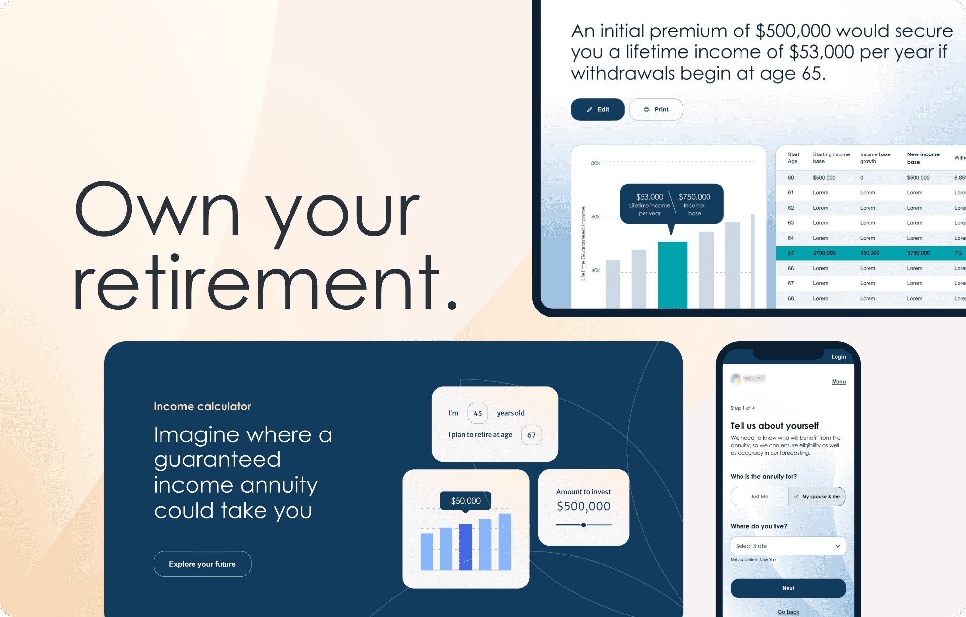
As Talcott prepared to launch its first retail annuity offering, stakeholders were concerned that the new income calculator wouldn't receive enough visibility. I designed persistent entry points that promoted the tool where prospective customers naturally explored retirement products.

Originally it appeared only in the top navigation, under Retirement solutions.
I added a CTA that appears across retail-focused pages to keep the calculator discoverable throughout the journey.
Also added a dedicated link beside Login for quick access by financial professionals and returning users.
Final homepage design

Impact
Enabled independent content management through clear authoring patterns and user friendly CMS components.
Learnings
Digital transformation starts with organizational alignment.
The most important design decisions happened before the first screen was ever made.
New design doesn't need to come at the expense of continuity.
Thinking through how legacy users would interact with the new site was just as important as designing the experiences for new customers.
Strong strategy creates consistency.
Grounding the visual system in the stakeholder-tested brand principles gave every design decision a clear rationale and kept the experience cohesive as it grew.
Different audiences don't need different brands.
A shared visual system and clear audience pathways, allowed Talcott to evolve toward retail without fragmenting the experience again.